If you’ve ever stood in front of a high-resolution digital art display, only to find a once-stunning masterpiece looking soft, muddled, or like it’s been printed on blurry fabric, you know how disheartening that can be. As a digital art display supplier, I’ve spent thousands of hours troubleshooting this exact issue for galleries, art collectors, and interior designers who rely on our screens to showcase work exactly as the artist intended. Sharpness isn’t just a “picture quality” buzzword here—for digital art, it’s the difference between a brushstroke that feels tangible enough to trace and a work that feels flat and unengaging. But adjusting sharpness on these displays isn’t as simple as cranking a slider to 100. There’s a science to it, and getting it right means balancing the needs of the art, the viewer’s experience, and the unique hardware of your display. Today, I’m breaking down what I’ve learned over the years about adjusting sharpness for digital art displays, no prior tech expertise required. Digital Art Display
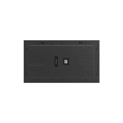
First, let’s get one thing straight: sharpness in digital art display isn’t the same as “crispness” you might look for in a streaming show or a video game. Video content uses sharpness to enhance edges and make fast movement look clear, but art is static. For a painting, a digital illustration, or a photograph, sharpness here refers to the ability of the display to render fine details—hair strands, tiny brush marks, the texture of canvas, or the subtle gradient between colors—without adding harsh artifacts like halos around edges, blocky pixels, or unnatural “over-boosted” lines. A lot of first-time art display clients come to us thinking higher sharpness is always better, but I’ve seen a Monet digital painting look like a flat cartoon when sharpness was cranked too high. It missed the soft, dreamy quality Monet intended, turning delicate water lilies into blocky blobs with hard outlines. That’s why the first step in adjusting sharpness is understanding your display’s native resolution and pixel density, because that’s the baseline for what “proper sharpness” even means.
Every digital art display we manufacture and supply has a native resolution—this is the number of pixels it’s built to display, and it’s non-negotiable when it comes to sharpness. If you try to display an image at a resolution lower than the display’s native, you’ll have to scale that image up, which blurs details. Conversely, if you force the display to show a resolution higher than its native, it’ll downscale, also leading to softness. For example, our 27-inch 4K digital art display has a native resolution of 3840×2160, with a pixel density (PPI) of around 163. For art, the sweet spot for PPI is generally 150 to 200 PPI—low enough that you don’t see individual pixels when standing 3 to 5 feet away (the typical viewing distance for most home galleries or office installations), but high enough that fine details stay sharp. If your display is lower resolution, say a 1080p screen, you can’t expect the same level of sharpness as a 4K model—but that’s where software adjustments come in to compensate, not hardware.
Now, let’s talk about the actual adjustment steps, starting with the built-in settings that come with every digital art display. Most people skip the calibration mode and just tweak the sharpness slider in the picture menu, but that’s a mistake. Our displays come with a dedicated “Art Calibration” preset, separate from the “Vivid” or “Game” presets that are designed for other content. Those presets crank sharpness up to appeal to fast-paced video, and they’re terrible for art. First, navigate to your display’s settings and select the “Art” or “Professional” picture mode. This mode disables any motion smoothing, color processing, and sharpness over-boost that’s meant for moving images.
Once you’re in the Art mode, find the sharpness slider—on our displays, it’s located under “Image Adjustments,” not in the “Enhancements” submenu where the video-focused sharpness controls live. Start by setting the sharpness to 0 first. That sounds counterintuitive, right? But when you set sharpness to 0, you’re seeing the display’s true native sharpness, unaltered by any processing. Next, pull up a high-resolution test image designed for digital art—we recommend our clients use a 300 DPI version of a test file that includes both fine details (like a line of text with tiny font) and soft gradients (like a sky or a water reflection). This test file lets you see exactly what’s happening as you adjust. Now, slowly increase the sharpness slider by increments of 5 or 10, stopping every time to look at two things: first, the tiny text. If the letters start to look fuzzy or the edges get a faint white or black halo around them, that’s over-sharpness. Second, look at the soft gradient. If you start to see a hard line where the color should blend smoothly, you’ve gone too far. For most art displays, the ideal sharpness setting is between 10 and 30—any higher than that, and you’re adding artifacts that don’t exist in the original art, any lower, and you’re losing fine details.
But wait—adjusting sharpness isn’t just about the display settings. There are two other key factors that people overlook: the color space and the image scaling method. Let’s start with color space. Most digital art is created in RGB color spaces like sRGB or Adobe RGB, but if your display is set to a YCbCr color space, that can compress data and make edges look soft. YCbCr is designed for video, not static images, so in your display settings, make sure the color space is set to “RGB Full” or the matching color space of your original art file. If your art is in Adobe RGB, don’t set the display to sRGB—you’ll lose colors, and edge details will appear blurred because the data is being processed incorrectly.
Next, scaling. When you display an image on a digital art display, you have to scale it to fit the screen, and the scaling method has a huge impact on sharpness. On our displays, we use a bicubic scaling algorithm that’s optimized for art, but some displays use bilinear or nearest-neighbor scaling, which can muddle details. Nearest-neighbor scaling, for example, just stretches pixels without smoothing, which makes edges look jagged instead of sharp. Bilinear scaling blurs too much, while bicubic balances smoothness and detail. If you notice that when you set the sharpness slider correctly, edges still look soft, check your display’s scaling setting—look for an option like “Image Scaling” or “Resize,” and select “Fit to Screen with Bicubic” (or the art-specific scaling option) instead of auto-scale. Also, make sure the image is centered, not stretched or squished, because that will distort edges and make sharpness impossible to get right.
Another common issue I see is related to viewing distance and lighting. Sharpness is subjective based on how far someone is standing from the display. If your display is in a living room where people stand 8 feet away, the sweet spot for sharpness is lower than if it’s in a gallery where viewers stand 3 feet away. At 8 feet, you won’t see tiny details like a single brush stroke, so you can lower sharpness a little to avoid harshness. At 3 feet, you need a bit more sharpness to make those brush strokes visible, but not so much that they look artificial. Lighting also plays a role—if your display is in a room with bright overhead lights, glare can make edges look soft. Try adjusting the display’s brightness first: art should be set to around 120 to 150 nits, not the 500 nits common for video displays. Brighter screens cause glare that washes out fine details, making sharpness seem lower than it actually is. If glare is still an issue, add a matte screen filter (we supply anti-glare matte filters for all our displays) that cuts down on reflections without affecting sharpness.
Wait, what about when you’re using a calibrated computer to send art to the display? A lot of our clients use a laptop or desktop to manage their digital art library, and if that computer’s display isn’t calibrated, it can send bad data to the art display, making sharpness look off. Color calibration tools like X-Rite i1Display Pro let you calibrate both your source computer and your digital art display to ensure that details are rendered correctly across both devices. For example, if your computer’s color settings are too saturated, the edges of your art might look over-processed when sent to the display, and if they’re too low, details will be lost. We always recommend that clients calibrate their system at least once a month, because screen settings can shift over time as the display ages.
Let me share a real example from a client last year to show how this works. A small gallery in Portland ordered 10 of our 32-inch 4K digital art displays to showcase contemporary oil paintings. When they first installed them, the gallery manager cranked the sharpness to 80 because they thought that would make the paintings look crisp. But when we came to troubleshoot, we saw that the brush strokes on a piece by a local artist looked harsh and blocky, and the texture of the canvas was completely lost. We walked through the steps together: set the display to Art mode, sharpness to 0, used the art test file, and adjusted sharpness to 25. Then we set the color space to Adobe RGB (which the artist used to create their work), turned on the art-specific scaling, and lowered the display’s brightness to 130 nits. The difference was night and day— the brush strokes looked soft but distinct, the canvas texture was visible, and the colors matched the artist’s digital files exactly. The gallery manager told us later that visitors were asking about “how the paintings look so much more real” than they did on the old digital screens they’d used before.
There are also some myths I want to bust about sharpness for digital art displays. First, more pixels don’t automatically mean better sharpness. A 4K display is sharper than a 1080p one, but if you scale a low-resolution image to a 4K screen, it will still look soft, no matter what the sharpness slider is set to. Second, sharpness isn’t a replacement for resolution. If you need to display very fine details, like a digital illustration with 1-pixel lines, you need a high-PPI display, not just a high sharpness setting. Third, every piece of art will have a different ideal sharpness. A hyperrealist painting will need a bit more sharpness to show fine details, while an impressionist piece like Monet’s will need a lower sharpness to preserve its soft, atmospheric quality. That’s why adjusting sharpness is a personal process, not a one-size-fits-all setting.
Now, let’s talk about maintaining sharpness over time. Digital art displays, like any tech, change as they age. The pixels can degrade, the display’s settings can get reset, and calibration can drift. We recommend that clients re-calibrate their displays every 6 to 12 months, and do a quick sharpness check every time they upload new art to the screen. It’s a simple process: pull up a new art file, compare it to the original digital file on your computer, check for halos around edges, make sure fine details are visible, and adjust the sharpness slider as needed. If you notice that no matter what you do, sharpness still looks off, it might be a hardware issue—like a faulty display panel or a loose video cable. In that case, our support team is always here to help.

At the end of the day, adjusting sharpness on a digital art display is about serving the art, not the display. It’s not about having the highest sharpness number or the most settings—it’s about making sure the work looks exactly as the artist intended, with all its details, textures, and subtlety intact. If you’re in the market for a digital art display that’s built specifically to showcase work correctly, with features like art-optimized scaling, adjustable sharpness controls, and easy calibration tools, we can help. Whether you’re a gallery, a collector, a hotel, or an office looking to display art, our team can walk you through every step of setting up and adjusting your display to get the perfect sharpness for your specific needs. Contact us today to discuss your requirements and find the right digital art display solution for you.
Outdoor LED Screen References:
- Digital Art Exhibition Guidelines, International Association of Digital Art Curators, 2022
- Display Calibration and Image Quality, Society for Information Display (SID), 2021
- Best Practices for Static Image Display, Display Supply & Accessories Association, 2023
- Pixel Density and Visual Perception for Art Displays, Journal of Digital Media in Art, 2020
- Color Space Optimization for Static Content Displays, HP Display Technology Research, 2022
LiKYLIN (Chongqing) Intelligent Technology Co., Ltd.
As one of the most professional digital art display manufacturers and suppliers in China, we’re featured by quality products and low price. Please rest assured to wholesale advanced digital art display in stock here and get free sample from our factory. We also accept customized orders.
Address: Building 1, No.57, Jinfu Blvd, Gu’nan Street, Qijiang District, Chongqing, China
E-mail: marketing@likylin-led.com
WebSite: https://www.cqlikylinled.com/
